In the ever-evolving world of web development, staying up to date with technologies and trends is crucial. Bootstrap is one such technology that has revolutionized how websites are designed and developed. Developed by Twitter, Bootstrap is a robust front-end framework that enables developers to create responsive, mobile-first websites easily. In this blog post, we will explore the uses and benefits of Bootstrap and understand how it can make web development faster and easier.

What is Bootstrap?
Bootstrap is an open-source CSS (Cascading Style Sheets) framework that provides pre-written CSS and JavaScript components. It offers a grid system, typography, forms, buttons, navigation, and many other UI elements that can be readily used to build a visually appealing and responsive website. Bootstrap follows the mobile-first approach, ensuring that websites look and function seamlessly across different devices and screen sizes.
Benefits of Bootstrap:
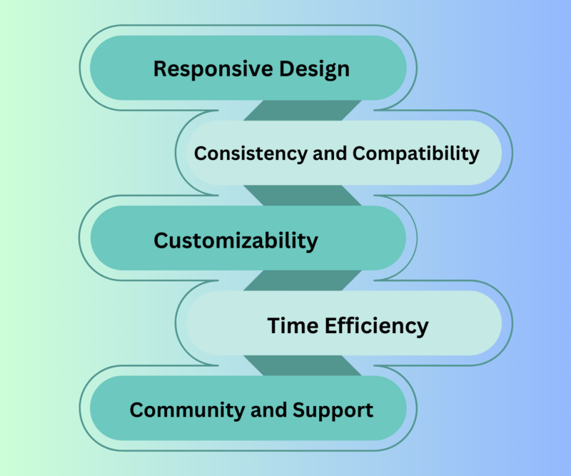 Responsive Design:
One significant advantage of Bootstrap is its built-in responsiveness. With its responsive grid system, developers can easily create websites that adapt to various devices, such as desktops, tablets, and smartphones. This eliminates the need for writing custom CSS media queries and saves a significant amount of development time.
Consistency and Compatibility:
Bootstrap ensures cross-browser compatibility, meaning websites built with Bootstrap will work smoothly across browsers, including Chrome, Firefox, Safari, and Internet Explorer. It also provides design and user experience consistency, allowing developers to maintain a unified look and feel throughout the site.
Customizability:
While Bootstrap provides a wide range of ready-to-use components, it allows developers to customize the framework to suit their needs. With the help of its extensive documentation and SASS (Syntactically Awesome Style Sheets) support, developers can easily modify the default styles, colors, and layout to match their project requirements.
Time Efficiency:
Bootstrap significantly speeds up development by providing a solid foundation and reusable components. Developers can leverage the pre-built CSS and JavaScript components, reducing the code they need to write from scratch. This saves time, ensures consistency, and reduces the likelihood of errors.
Community and Support:
Bootstrap boasts a vast and active community of developers who contribute to its continuous improvement and support fellow developers. The community-driven nature of Bootstrap means that developers can find helpful resources, tutorials, and plugins that enhance the framework's functionality, making it easier to implement complex features.
Bootstrap Tips and Tricks for Faster Development
Bootstrap can help you create beautiful and responsive websites quickly and easily. Whether a beginner or an experienced developer, these Bootstrap tips and tricks can help you streamline your workflow and create stunning websites that look great on any device.
Use pre-built templates and themes.
One advantage of using Bootstrap is the availability of pre-built templates and themes. These templates and themes can save time and effort as they come with pre-designed layouts, styles, and components. You can personalize them to suit your requirements and preferences rather than starting from scratch. Bootstrap's official website offers a wide range of free and premium templates and themes that can be used for your projects. Many third-party websites and marketplaces also offer Bootstrap templates and themes, such as ThemeForest and WrapBootstrap.
Using pre-built templates and themes is an efficient way to expedite your development process and ensure consistency in your design. With Bootstrap, you can easily find templates and themes that match your project's style and requirements. Whether you're building a website, web application, or mobile app, a Bootstrap template or theme can help you get started. Many of these templates and themes are responsive, meaning they will look great on any device. So, if you're looking to reduce time and effort on your next project, consider using a pre-built Bootstrap template or theme.
Customize Bootstrap variables to match your brand.
Bootstrap website can customize the default variables to match your brand's colour scheme and typography. Bootstrap provides a set of variables that control the colours, fonts, and sizes used throughout the framework. By modifying these variables, you can create an exquisite look and feel for your website that aligns with your brand identity. To customize the variables, create a new file called "_custom.scss" and override the default values with your own. This file should be imported after the main Bootstrap file in your project's stylesheet.
Once you have created your custom variables file, you can start tweaking the values to match your brand. For example, you can change the primary color to match your brand's logo, adjust the font sizes to fit your typography, and modify the spacing to create a more balanced layout. It's essential to remember that Bootstrap is a responsive framework, so you'll want to test your changes across different screen sizes to ensure your website looks great on all devices. With some customization, you can take your Bootstrap website from generic to unique and on-brand.
Utilize Bootstrap's grid system for easy layout design.
Bootstrap's grid system is one of its most powerful features, allowing developers to create responsive layouts for their websites easily. The grid system is based on a 12-column layout, which can be customized to fit the needs of your website. Add the appropriate classes to your HTML elements to use the grid system. For example, you would add the classes "col-md-6" to two separate divs to create a two-column layout. This will automatically adjust the width of the columns based on the screen size, ensuring that your website looks great on any device.
Bootstrap's grid system decreases time and effort in designing layouts. A few lines of code can create complex layouts that are responsive and visually appealing. The grid system also includes options for offsetting columns, nesting columns, and adjusting column widths for different screen sizes. Whether you're a newbie or an expert developer, Bootstrap's grid system is a valuable tool for creating beautiful and functional websites.
Take advantage of Bootstrap's built-in components.
Bootstrap comes with various pre-built components that save you time and effort when developing your website. These components include navigation menus, forms, buttons, and models. Using these pre-built components, you can quickly add functionality to your website without writing any code from scratch. Plus, because these components are built using Bootstrap's CSS and JavaScript, they are already optimized for responsiveness and cross-browser compatibility. So, take advantage of these built-in components to accelerate your development process and create a more polished website.
One significant advantages of using Bootstrap is quickly incorporating pre-built components into your website. For example, if you need a navigation menu, you can customize Bootstrap's navbar component to fit your needs. Similarly, if you need a form for users to submit information, you can use Bootstrap's form components to create a professional-looking form quickly. And if you need to display a modal window, Bootstrap's modal component makes it easy to do so without having to write any JavaScript code. Taking advantage of these pre-built components saves time and effort while creating a website that looks and functions great.
Use third-party plugins to extend Bootstrap's functionality.
While Bootstrap comes with many pre-built components, there may be times when you need additional functionality that needs to be included out of the box. In these cases, you can use third-party plugins to extend Bootstrap's capabilities. For example, if you need a more advanced carousel or slider, you can use a plugin like Owl Carousel or Slick Slider. Or, if you need to add more complex forms, you can use a plugin like jQuery Validation. By using these plugins, you can save time and effort while still creating a visually appealing and functional website.
Bootstrap has a large and active community of developers who create and share plugins. You can find these plugins on sites like GitHub or through a simple Google search. Once you've found a plugin that meets your needs, you can easily integrate it into your Bootstrap project by including the necessary CSS and JavaScript files. Read the documentation carefully and thoroughly test the plugin before deploying it to your live site. With the right plugins, you can take your Bootstrap project to the next level and create a unique and powerful website.
Conclusion:
Bootstrap has transformed the way websites are designed and developed. Its robust set of pre-built components, responsive grid system, and ease of customization have made it a favorite choice among web developers worldwide. By leveraging Bootstrap, developers can save time, maintain consistency, and create visually stunning and responsive websites across various devices. Whether a beginner or an experienced developer, Bootstrap is a dynamic tool that can streamline your web development process and help you deliver exceptional user experiences.
Newsletter to recieve
our latest company updates
Comment